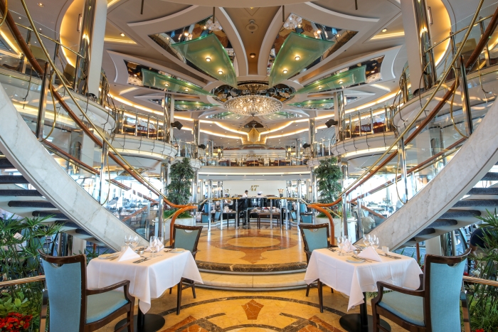
Objective – the main (formal) dining room on board is split over two decks. Previously this restaurant was very themed with lots of Oriental style gold sconces and even a six metre gold pagoda. It was served by two galleys so my objective was to split this into two restaurants, giving customers more dining choice.
My role – to oversee concept development (both creatively and commercially), ensuring feasibility within budget and working with Apollo catering to develop menus and operations to deliver the concept, from overall layout, design, branding and storytelling, to signage, crockery, glassware and uniform.
Solution – 47° is the main dining room downstairs with circa 500 covers offering a contemporary a la carte menu including British favourites. Gallery 47° is upstairs with just under 400 covers and offers a contemporary Italian menu (as chosen by customers via a social media campaign).
The principle for the design was to strip back the Oriental theme and provide a simple, contemporary interior. Nuances of the design included signage used as artwork, screens to draw attention away from waiter service stations, the mix of dining tables was changed to accommodate more 2s and 4s and new dining chairs installed upstairs.
Outcome – Both restaurants have been given a new lease of life and are extremely popular with customers, demonstrating how a stripped back design can work – especially from a budgetary perspective. The venue names allow story-telling as 47° is the latitude of St Nazaire in France where the ship was built!

